[INFO] Themes and UI
A brief update
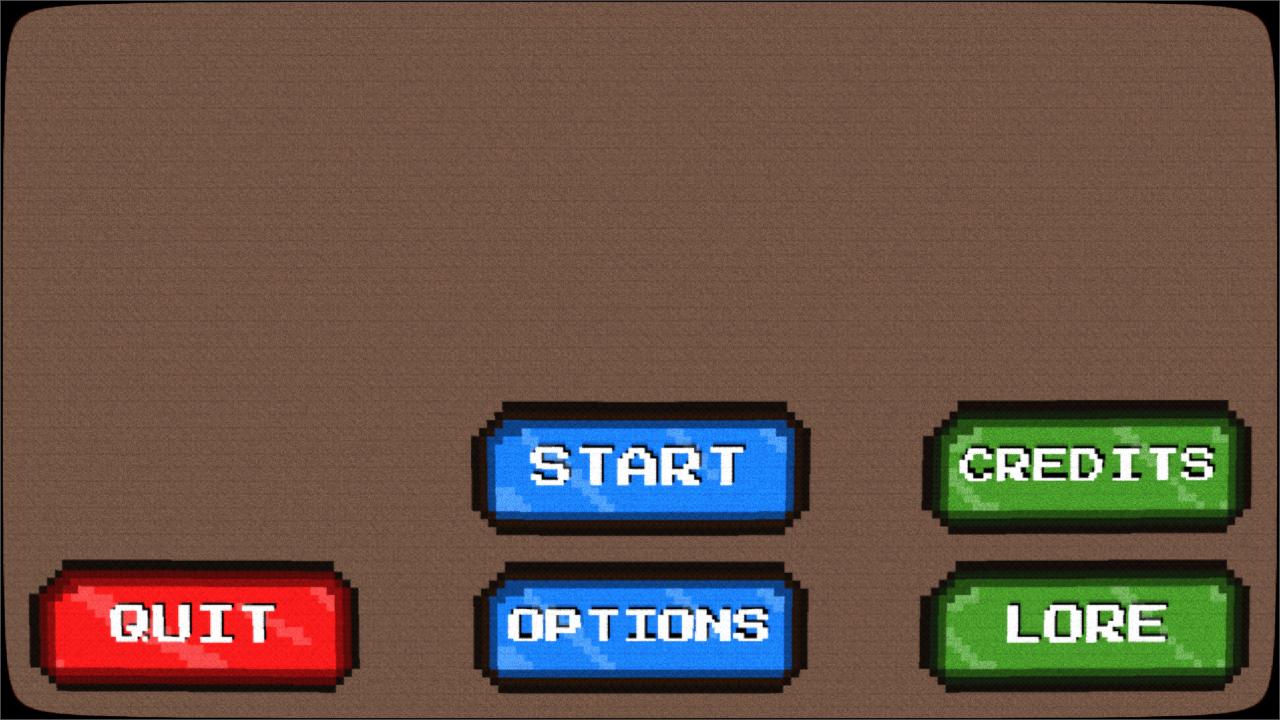
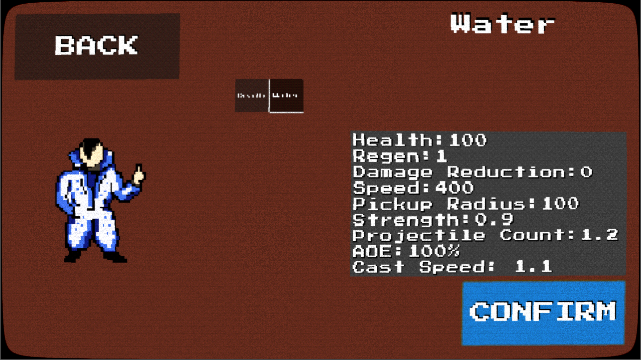
No new content this time, apologies. I am still hard at work on the next update though. It's been quite the ride getting a grip on where I wanted to take the presentation of the game, how the UI would look and all that. I ended up deciding on a retro look. The long and short of it is that I don't like this look just yet. As an example, see the image below, it garbles smaller text way too much. So while what you see here is "close" to what it'll look like in the next update, it isn't final.
Technical
First, the CRT-style filter - I want to thank Art-Michel of Github for their work on this shader. I had to make some small tweaks to get it working the way I liked, but they did the heavy lifting.
Next, I wanted a specific effect when the player clicks a button. That effect is still in development, so I can't show it quite yet. The default Godot buttons weren't up to the task, so I made my own. It sounded worse than it was. I wanted to sandwich the text between the background and foreground of a button, and have button events affect the text (like hovering or a click), while allowing Godot's skinning feature to work on the button and text.
Feedback
Feedback is welcome here. If you think this looks awful, awesome, or have something in mind for a different look, please let me know! I'm not afraid to scrap it and start from the beginning.
Leave a comment
Log in with itch.io to leave a comment.